
The Fine Line Between “Vintage Cool” and “Garage Sale Sad”
Vintage-style graphics are a vibe — soft, lived-in, nostalgic. But when done wrong? They look like you pulled a clearance shirt from 2011 and hoped no one would notice. The goal is intentional fading — the kind that says “I paid extra for this look,” not “my dryer’s on strike.”
Whether you’re designing for a new drop or rebranding your print shop’s retro collection, mastering that authentic fade takes more than just dialing back opacity. It’s all about ink behavior, texture, and the right blank.
1. Start with the Right Blank (Seriously, It Matters)
Your print is only as good as the fabric beneath it. If your blank feels rough or inconsistent, no amount of distressing will save it. You need a smooth, soft surface that holds ink just enough to let the fade breathe.
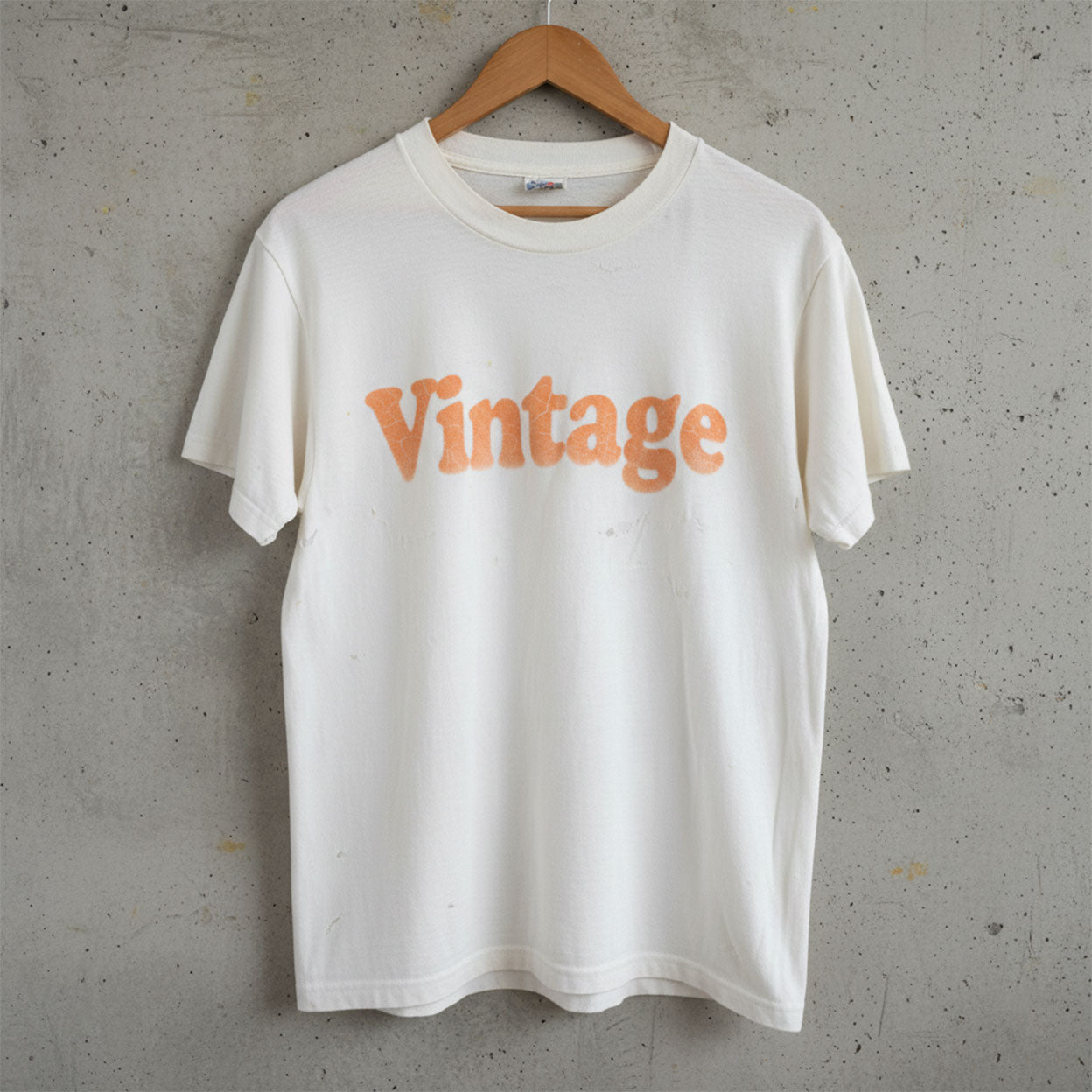
The Cotton Perfection T-Shirt 3100 is ideal — 30 singles combed ring-spun cotton, ultra-soft, and built for detailed vintage effects. Its fine knit helps ink sit close to the surface, letting every fade, crack, and worn edge feel natural, not forced.
If your blank is too coarse, you’ll get uneven absorption — aka “cheap flea market fade.” Not the look we’re going for.
2. Use Ink That Ages Gracefully
Not all inks are created equal. Plastisol’s durability is great for bold logos, but if you’re chasing that worn, vintage aesthetic, you need to tweak your formula.
Try water-based or discharge inks for that soft-hand, “already broken-in” look. Thin out your ink slightly and use a lower mesh count to control deposit. The key is restraint — too much ink and your fade turns fake.
Another trick? Mix a bit of neutral white into your main color to desaturate it. That slight dullness adds authenticity, like it’s been washed a dozen times before hitting the shelf.
3. Distress with Purpose (Not Just Filters)
Stop letting Photoshop do all the heavy lifting. Real vintage looks come from physical texture, not digital filters. Try these pro hacks:
- Lightly sandpaper the print after curing for organic wear.
- Under-cure slightly for micro-cracking (test first!).
- Use halftones or grain overlays to simulate natural ink breakup.
Remember: you’re not trying to destroy the print — just give it that “favorite shirt since high school” energy.
If you need more inspiration for textures and placement, check out our hoodie printing guide — those same layout principles apply perfectly to retro graphics.
4. Don’t Forget Color Psychology
Vintage doesn’t just mean “faded” — it means familiar. Stick with palettes that feel nostalgic: muted reds, sun-faded blues, washed-out yellows, and creamy neutrals. Avoid overly bright or digital colors.
Pair these shades with blanks that enhance the vibe. Off-whites, sand, and ash gray give instant throwback appeal — especially when printed on soft-touch cotton like the 3100.
The Art of the Intentional Fade
The perfect vintage tee isn’t old — it’s engineered. Every choice, from ink to fabric, tells a story. The more authentic your details, the more premium your “aged” design will feel.
So go ahead — fade it, crack it, wash it. Just do it with purpose. And always start with a quality foundation like the Cotton Perfection T-Shirt 3100, designed to make every print look intentional from day one.
Explore more SpectraUSA blanks and subscribe for more printing hacks that turn vintage into value.
Quick Answers
What’s the best ink for vintage prints?
Water-based or discharge inks give soft, natural fades that age beautifully.
How do I make new prints look authentically old?
Sandpaper distressing, low-cure techniques, and muted color palettes all help.
Do certain fabrics make fades look better?
Yes — smooth, fine cotton like the 3100 ensures even ink wear and realistic texture.
Share:
How to Create a Brand Aesthetic That’s 100% Yours
Top Print Trends of 2025 for Apparel Brands